When a logo is designed, it works in way that when you’re exposed to it, the design leaves a lasting impression. The choice of colors and style of design helps ignite familiarity when you come across the logo time and time again. But the real question is, does that sense of familiarity still hold if the logo was in another language?
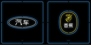
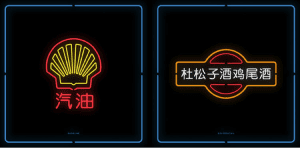
An artist named Mehmet Gozetlik put this theory to the test in his new project called “Chinatown”. He takes familiar western logos and turns them into Chinatown inspired neon signs, just like the ones you see at your local Chinese restaurant.
The project is described as being the Chinese translation of trademarks in a graphical way. According to Gozetlik, “’Chinatown’ [project] pushes viewers to ask themselves what it means to see, hear, and become fully aware. ‘Chinatown’ also demonstrates our [culture’s] strangeness to 1.35 billion people in the world, when you can’t read Chinese. ”
His work is fascinating and allows viewers to see how different logos are remembered, whether it’s the color or the shapes we associate with different brands. The Chinatown signs indicate the sweet spot for a great logo that can bridge the gap between the East and the West. In addition, it doesn’t necessarily have to do with the typography, but rather with the distinctiveness of the art.
Some of the logos such as 7-11, Master Card, Shell, Burger King, and Pepsi are easily recognizable when they were adapted into Chinese. The Starbucks logo and the Chiquita Banana logo were also easy to distinguish because of their distinctive mascots. The most challenging ones are the ones most typography driven, like Intel or Best Buy. Gozetlik’s “Chinatown” project brings up a good question – should designers be designing with globalization in mind? As more companies aim to expand internationally, perhaps this is something their designers will need to keep in mind as they develop the brand’s identity.
Take a look at some of the logos and see if you can recognize which ones are which.


