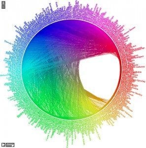
Big data is a big deal. Everyone, whether they realize it or not, is contributing to the monumental amount of data being collected every second of every day. From your daily step count to your social media activity, anything related to an Internet-connected app is collecting data. Although this may seem like a scary thought, users have come to accept their role in big data, and most are embracing the benefits of massive data collection, especially in the workplace.
The user’s experience with an application that is responsible for presenting and collecting big data needs to be streamlined to maximize usability. This is where designers come in. All of the information in the world is useless if users cannot access and understand it. As big data exponentially grows, the proliferation of big data applications will boom over the next five to ten years. Designers are posed with the goliath task of designing big data apps that provide users the best possible experience.
So, let’s take a look at some pointers when it comes to successful user experience (UX) design for big data apps.
1. Make data the star of the show.
Any data-driven application is based on, you guessed it, the data. Oftentimes designers can get caught up in user interface buttons and motion capabilities, but is imperative that designers focus on a UX that focuses on delivering the data to the user so they can better understand it. The UX should be focused around how the user can best consume and understand the data to glean greater insight and help make decisions.
2. Keep it simple.
Keeping the UX simple sounds like it would make a designer’s job easy, but in truth, one of the greatest struggles in designing a big-data app is keeping the interface simple. More often than not, big data apps are chock-full of highly important data, so the challenge lies in presenting complex data in a simple and understandable way. The best way to accomplish simplicity is to have a clear understanding of what the app’s users’ goals are, and what they consider to be most important. If the designer can create an experience that presents the data in an approachable, useful, and understandable way, then they have succeeded.
3. Determine the app’s true purpose.
It is important for designer to approach their UX design with a clear understanding of how the end-user will interact with the app, and what the user’s expectations are. Having a clear user experience vision will ensure that the app’s functionality focuses on the important elements, while still providing access to auxiliary functions that may not be necessary for all users.
4. Prioritize user types.
It is the responsibility of the designer to understand that there will be a variety of users who will be interacting with the big data app. The users will have a wide range in levels of understanding, comfort, and understanding of the data. The designer should assume that every user first using the app will be a “data novice,” but with successful UX design, the user can transform into a data juggernaut. The app should be designed so that core features and information have a heavier visual appeal to help the user prioritize the presented information. If the user so chooses to dive deeper into the apps functionality, secondary features should be easily available, but not competing visually with the primary functions. This being said, designers should avoid the enticing “hamburger button” where you can cram a ton of functionality within a tiny, non-descript button. You can read more about the naughty little button in our past blog, Ditch the Hamburger Button on Mobile Apps.
All designers of data-driven apps should have the same goal: make the experience easy and empowering for the user. Designers can accomplish this by considering the user, planning the apps goals, and creating a streamlined interface. As much as it may pain the designer mind, you need to throw away the bells and whistles and design a clean and simple UX. After all, big data is the star of the show, and she does not like to be overshadowed by superfluous visuals.


