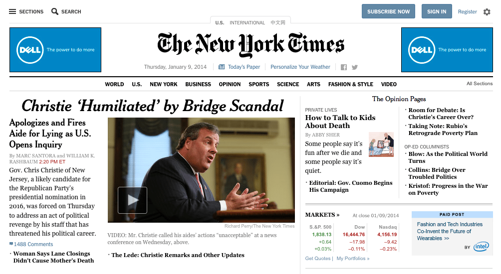
Incitrio Branding & Marketing Agency isn’t the only company to launch a new website yesterday. The New York Times launched a brand new website design yesterday, and it definitely has people talking.
While it’s not perfect, the Times’ redesign is a nod to changing user experience standards. The new site is a mix of the traditional printed newspapers and the new digital norm. Courtesy of Fast Co.Design, here are some of the highlights of the new Times’ site, and why they’re relevant in the world of 2014 UX.
No More Page Turning
If you’d ever tried to read an article on The New York Times website, you know that you were forced to click through pages in order to view the full article. As anyone in UX design will tell you, the less clicks, the better. Paginated content is out, long scroll content is in. The new Times website eliminates pagination and instead has articles displayed on one page that you can scroll through. The earlier pagination design was really just a way to increase page views for advertisers, so we can all now rejoice with this new design.
The page loads faster, the reading experience is more natural, and it’s a higher-tech and modern experience.
There is still a “page turning” functionality, but now it allows you to move between articles instead of pages within an article.
Comments Placement
The comments are no longer below articles. Now, comments appear next to the article content and allow you to scroll through the active feed. Any commenter now has equal visibility with the article itself. There are definitely positives and negatives to this placement, but in today’s world, users expect to have their voices heard (think social media).
New Navigation
The new Times website is responsive, accommodating devices from PCs to tablets to smartphones. The navigation has changed to match the new responsive design and is now accessible on mobile by clicking (or tapping) on a menu in the upper left part of the page.
Via the new mobile menu, users can choose from various links to go to main landing pages, as well as any other pages on the site. The design is supposed to mimic the experience of thumbing through the newspaper sections while still holding a finger on your current page. Of course, it’s hard to capture that experience on a device, so the outcome is a bit confusing for users entrenched in current UX trends. The Times is trying to invent a new style, one that combines the traditional top-level approach and a cascading tree into one menu. Of course, the problem with pioneering a new UX design element is that users will initially be confused.
But, once the user gets past the initial confusion, he/she will probably be able to quickly navigate throughout the site, which I obviously a positive.
A Home That’s Lacking
The one area that’s glaringly lacking on the new Times site is the homepage. The New York Times website is the very definition of content-heavy website, and like other sites stuffed to the pixels with content, the Times homepage is a “link farm.” There are dozens of clicking options, just as in previous iterations of the site’s design.
Navigating from the homepage to other sections, including the Technology section, can be frustrating. Because it’s not a top level navigation category, it requires opening the menu and mousing down to News, then clicking Tech on the fly out menu. That’s a lot of chances to miss the hover state and get stuck in an endless loop.
Overall, the new The New York Times website is a faster, less frustrating, more modern version of the country’s most respected newspaper.


