 Everything about parking signs suggests they’re meant to aggravate you, not only with their restrictions, but also with their poorly designed presentation of those restrictions. If you are familiar with parking in a city, your process usually looks like this: park in the spot, get out, walk to the nearest sign, and gaze longingly at it, wishing it were faster to read, made sense, and didn’t require getting out of the car to see, especially when it delivers the bad news of, “No, you cannot park there.” If you do this in a city you don’t frequent, this can be such a tedious and taxing process that it’s almost crazy that no one has stepped up to tackle this problem before, until now.
Nikki Sylianteng, a designer in New York, is going out of her way to make sure that parking with hesitation and frustration is a thing of the past. Sylianteng has been putting her signs up in New York (which happened to introduce a new design last year) and soliciting feedback on her website to further the design. LA’s city council has recently reached out to her in regard to her designs with the hopes to experiment with her designs in the real world. Currently, the Transportation committee is in discussions with the rest of the board to determine how they would implement her designs.
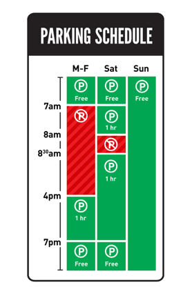
Nikki took on this project as a result of one too many parking tickets herself. She asked herself, “Why was this so complicated? How could I, as a designer, simplify the process?”
“My strategy was to visualize the blocks of time when parking is allowed and not allowed. Everything else was kept the same, the colors, the form. My intention was to show how a small but thoughtful change can make a big difference by saving drivers a lot of time, stress, and money. I tried to stay mindful of the constraints that a large organization, like the Department of Transportation, might face for this seemingly small change.”
Being a designer and taking on a problem like municipal design goes to show that there is a lot of room for improvement in the government’s consideration for user experience. Although LA is willing to try out this new signage, it is not a guarantee that the signs will change.
Aside from the overall design challenge, she’s still working out the smaller issues: How would colorblind people see a red and green sign? Will people who don’t read English be able to understand the signs? Should the week start on Sunday or Monday? To Park and Not to Park is definitely something that people should be on the look out for, or if you feel like a parking sign is confusing you in your neighborhood, she has a “Submit a Sign” form so that others can help her spread awareness of her campaign.