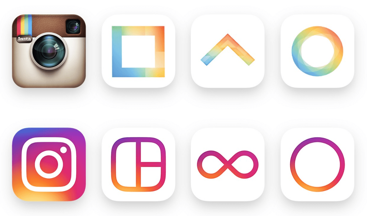
Instagram recently introduced a new look with an updated icon and application design, as well as redesigned icons for Instagram’s other creative apps Layout, Boomerang, and Hyperlapse. The rebrand represents a more simplistic, tye-dye version of the previous icons.
Instagram didn’t stop at redesigning their classic Polaroid symbol, but also made improvements on the inside look and feel of the apps functionality. Reflecting the vibrance and diversity of Instagram users stories, the companies new identity is based on the evolving global community of users sharing interests through more than 80 million photos and videos daily.
One of the most instantly recognizable logos in the tech industry, Instagram felt their famous skeuomorphic icon felt “dated” and was “beginning to feel, well… not reflective of the community, and we thought we could make it better,” says Ian Spalter, head of design at Instagram.
“The question then became, how far do we go?” Instagram said. “If you abstract too much, the glyph doesn’t feel tied to the history and soul of Instagram. If you make it too literal, it’s hard to justify changing from what we currently have. After a lot of refinement, we landed on a glyph that still suggests a camera, but also sets the groundwork for years to come.” But how will this drastic branding move affect Instagram? Was it necessary to ditch the well-known camera icon, which accurately represented the heavily based photo app?
The new icon was not an instant hit, and opinions regarding the symbol don’t seem to be changing any time soon. Users turned to Twitter after the emblem’s debut to share their opinions. “My eyes cannot un-see the atrocity that is the new Instagram logo, I usually embrace change but the @instagram update reminds me of Windows 95 and the icon looks like 3rd place in a middle school competition,” one user stated. “The new Instagram logo looks like a rejected Starburst flavor.”
Users form strong emotional bonds with brands they interact with the most, such as popular apps that they have become very familiar with. INC. Magazine writes, “The brands and logos with which we form the strongest bonds are likely apps–those on devices that we spend more time with than we do most loved ones.”
Companies that have such an impact on the daily lives of their users become disappointing when they altar something as significant as their logo without any admonition of change.
Considering there was no truly compelling reason to change Instagram’s brand identity to begin with, we’re all pretty annoyed. One extremely accurate Twitter rant stated, “Instagram getting a new ‘look’ is like 22-year-olds getting ‘preventative Botox.’ Completely unnecessary.”
The new icon’s design will surely get lost amongst a sea of mediocre apps on user’s phones. We can all agree that what Instagram sees as a considerable improvement, still needs some work. Better yet, lets just hit the rewind button and get back to the original design.