It’s that time of year…the time to look back on the best and worst of 2013! As much as we love the best and worst dressed lists, we are more interested in your nerdy pursuits. That’s why we were so excited to come across the Fast Co.Design’s article outlining the best infographics of the year.
We pulled out our favorites and let you know why. Check out the best of the best, below!
Common Styles
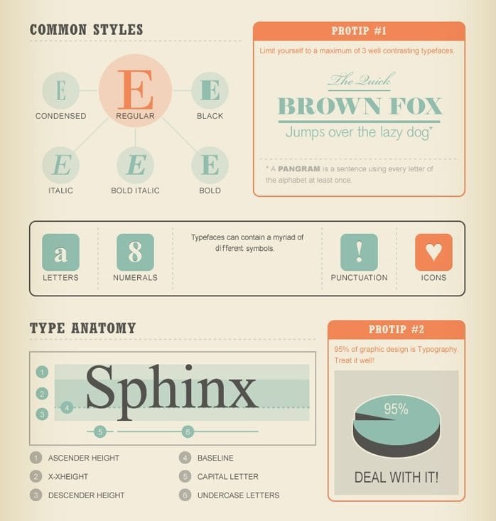
Okay, so it probably goes without saying (we’re a design firm, after all), but we REALLY care about typography. We love to love the best typography and hate on all the awful typefaces out there. This infographic that outlines the elements of typography, and why they’re important, is the perfect way to strike up a conversation with those non-design people in your lives. Our particular favorite is the pie chart in the bottom right hand corner: “95% of graphic design is Typography. Treat it well. Deal with it!”

The Ultimate Selfie
In a year where selfie reined supreme, you’ve got to appreciate former Facebook designer Nicholas Felton’s infographic documenting everything about his life in 2013. From how much time he spent with his girlfriend to how long it takes him to brush his teeth to how many screenshots he took, this infographic puts all of your “I’ll stretch out my hand and try to make this photo look totally impromptu even though I spent 10 minutes getting it right and discarded 10 photos” selfies to shame.
Cook Books Turned Visual
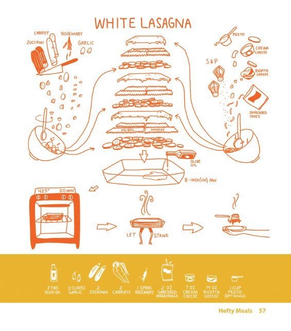
Who says cookbooks have to be a list of ingredients and directions? We mentioned this infographic earlier this year, but it’s definitely worth mentioning again. The Katie Shelly, a designer and illustrator, turned her favorite recipes into beautiful, fun, useful recipes. While most of us are used to traditional recipe formatting, it’s fun to look at recipes in a new way.
Emotional Chart
So if you’ve ever been a foreign language student, you know that there are certain words that just don’t translate. Sometimes, you might just be at a loss for an English word to describe how you’re feeling. Have no fear! This awesome infographic that resembles a really crazy web chart can clue you into some foreign words that might express what you’re feeling. Our particular favorite? Hiraeth, a Welsh word that means “Homesickness tinged with grief or sadness over the lost or departed and the earnest desire for the Wales of the past.” We’ve been looking for a way to describe that feeling!
The Cheesiest Infographic of All
Okay, this is our absolute favorite. There are very few things that deserve a spectrum the likes of the light spectrum you learned about in high school physics. Cheese is one of those things. For any lover of cheese, this fabulous spectrum will introduce you to cheeses you’ve never heard of, placed next to old favorites like “Parmesan” and sorted by cow’s milk, goat’s milk, sheep’s milk, and buffalo’s milk and hard, semi-hard, soft, and semi-soft. It doesn’t get any better, or tastier.


