 There have been a few common variables for start ups that succeed. First, have a concept that makes its users’ lives easier and second, have a killer design to attract attention. 2013 was a great year for tech startups such as Pinterest, Uber and Snapchat, all of which generated billions of dollars and infinite amounts of buzz. While other companies struggled to get out of the first phase of funding, there are a few notable companies that are moving quickly into full-fledged companies.
These 10 startups have made a mark in either UI design and/or having strong concepts for a successful business. UI design can help a start up move from a struggling infant organization toward an adolescent company with lots of energy and potential.
1. Circa
With the mobile and social media era taking over mobile news, it’s difficult to pick and choose what you really want to read about. Circa takes that idea and puts in the palm of your hand with a streamline and simplistic interface that is sure to get your attention. Circa has compiled its own editorial team that uses a wide variety of resources to give you very quick, short news bits with only essential facts, quotes, and photos to immediately keep you up to date. If something catches your eye, circa will direct you to another source with more information. By partnering this concept with a well-designed UI, Circa can find it’s way into becoming a well-known app for a generation of mobile users that want fast and relevant information that is readily accessible.
2. Level Money
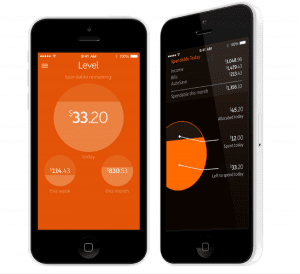
How do you reach out to a younger generation that may have no idea how to budget and keep track of their money? Mint has already made a dent in the personal finance industry with their simple design and friendly “new user” interface that it is almost hard to compete with something with that strong of a concept. Level has taken Mint and boiled it down to its simplest form with as easy to use app. It lets the younger generation see what they need to, like what can you spend and how you can save better, with no lines of numbers or confusing graphs. The user experience of this app is downright amazing and really helps you get started. With careful calculations, this app tells you exactly what you need to keep in the safe zone with your money and spending habits. The force is strong with this idea and hopefully we can see this really take off and make big strides to educate and help people that have no idea how to take care of their finances.
3. Routehappy
Let’s face it, not many people like to fly these days and trying to find the right flights is a drag. How do you put the happy back in your overall flight experience? Routehappy makes it their mission to “fly happier for less,” because everyone is happy when they have bargain flights, right? Not only do they let you know what flights are cheaper, but they also give you comparisons of flight experiences, seats, and amenities. So, if you want WiFi but the flight costs 10 dollars more, you know that you are getting exactly what you are paying for. This is another example of a great concept that is paired with a beautiful website. It really does make your experience from the web to the flight that much happier. What makes this website successful is the system of icons that relate to different flight happiness factors. These icons make scanning through each flight easy, and in a world where our time is money shaving seconds on what could be the happiest flight you can imagine really makes this site a standout.
4. Oyster
There are a pocketful of businesses that offer subscription services that have built themselves into billion dollar businesses over time (think Netflix and Spotify). But there hasn’t been any true subscription service for e-books. Oyster is bringing something to users that could potentially change the way we buy and use e-books. At a base price of $9.95 a user can break even just by reading one book a month and for those who go through several e-books a month it’s quite a deal. By taking out the question of purchasing one book at a time out of the conversation it makes it easy for a user to just start reading. Oster makes a good use of the swipe left to right feature to rummage through the books you’re currently reading, paired with images of book covers and a progress bar. And on the same screen there is a spotlight section for new books and authors. This app is kept as minimal as possible so that you don’t have to fight to get what books you want or are currently reading.
5. SmartThings
Other countries such as Korea and Japan have been dabbling in the realm of the smart home and recently the US has been catching up. It’s going to become one of those things that you didn’t realize you might have needed until you see it. The app brings you options to lock your doors or turn on your a/c during a hot summer’s day. The dashboard helps you to quickly swipe through the most important aspects of the smarthome. Don’t know if you turned off the lights before you left? Or are you away on a trip and need a way to make it seem like someone is home? It only takes two taps. Quick and simple. The interface gives you the right hierarchy of button visibility to give you exactly what you need in about 2 seconds. The app also gives your house personas that can text you directly through the app to notify you when threats or accidents happen while you’re away. It’s an investment that gives you ease of use and ease of mind.
Not only have these startups have the upper hand of changing the game in their market, they all make good use of design. A common thread between them is simple interfaces and a great thought into overall user experience. They have found a way to go beyond their product, because it’s not just the idea that sells the supplemental items that go with it have been taken into account and treated with great care. Take a lesson from these soon to be billionaire companies and don’t skimp out on a great website or UI design.


