The Google News Lab team consists of talented data scientists and designers. Their mission is to organize the world’s information and make it universally accessible and useful, and they are getting started by taking the reigns for this year’s Year in Search. Taking the annual report to the next level, News Lab is using Google Trends research to create some very captivating data visualizations.
Simon Rogers, News Lab’s Data Editor, has a vision for this year’s Year in Search to be something unique and innovative. “We wanted to make a useful tool for exploring the news and seeing how the world worked for the last year. We wanted to provide something beyond the social media echo chamber and show what people really care about.”
The aggregated data, in conjunction with the 3 billion voluntary searches a day on Google, create an unparalleled insight into peoples’ opinions, concerns, curiosities, and positions on public issues. They also have the unique ability to see where news stories begin to spread, based on where and when people begin to search a topic. The team at News Lab has the nearly impossible task to narrow down all of this information and find the most powerful information in order to tell the most interesting story.
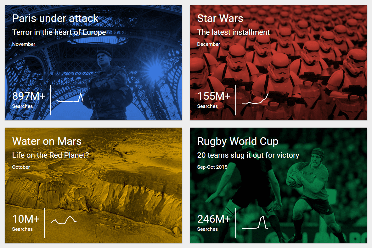
The Year In Search presents a timeline highlighting each month’s top searched world event. Attached to each monthly event are interactive visualizations, top global questions, top viewed news videos, and graphs displaying search trends. These are just a few ways users can see search trends from that month. All of the displayed search data is up to date and changes monthly to serve the current trends.
Because Google Search is used differently worldwide, News Lab wanted to make the Year in Search a more global experience. They did this by showing the major interests and concerns of 13 specific countries through global overviews of top searches and timelines, located in the top right corners drop down menu on the main page.
The November section is overflowing with information on the Paris Attacks, the world event highlighted for the month. Through careful design by Anna Vital, a designer on the News Lab team, an interactive infographic/timeline was created, displaying massive amounts of consolidated data, revealing the public broke the news before mainstream media did.
The macro trends being revealed through the creative design in the data visualization tools within the Year in Search will not only aid in making information more accessible to the general public, but can also be expanded and put to good use in the future by people such as policymakers and entrepreneurs. You could even say that Google News Labs’ 2015 Year in Search may be shedding some light on the beginning of data visualizations’ ability to predict the future.
To see the latest Year in Search, click here.