
Designing a successful landing page that entices users to click that all-mighty Call to Action (CTA) button is not an impossible feat. By following key guidelines and considering the user’s engagement with the page, you can see fantastic conversion success from landing page campaigns. The best way to learn is to learn from other’s mistakes, rather than your own, so let’s take a look at some examples of what NOT to do when creating your landing page content and layout.
Avoid the Over-use of Buzz Words
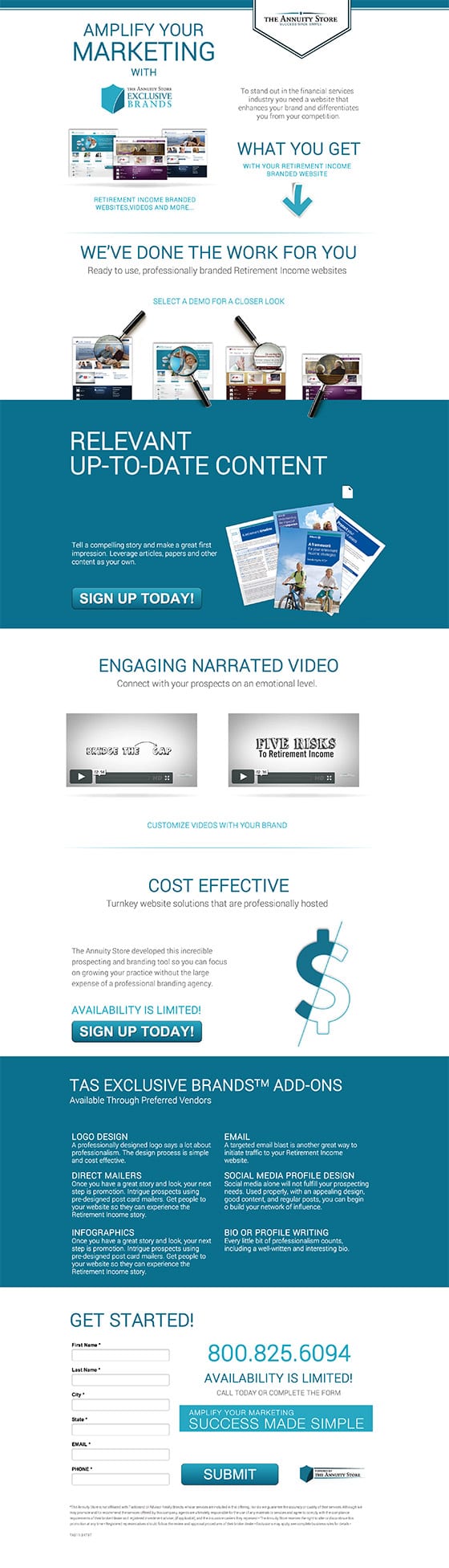
First off, take a look at the headers for each text segment in the landing page to the left. We have “AMPLIFY YOUR MARKETING,” “RELEVANT UP-TO-DATE CONTENT,” “COST EFFECTIVE,” “ENGAGING NARRATED VIDEO,” “TAS EXCLUSIVE BRANDS ADD-ONS,” and “GET STARTED.” If you read through each of the headers carefully, you realize that there is not a bit of useful information. People are busy and/or lazy, they don’t have time to read through every bit of tiny text you provide them, so your headers need to tell them why they should do business with you and why they should read more.
Use Appropriate Colors and Imagery
This example missed an opportunity to use a contrasting color for their CTA. When using a two-tone color design, you need to have a contrasting color for the CTA buttons in order to draw more attention to them. Like moths to a flame, viewer’s eyeballs can’t help but notice contrasting colors on a page.
Be sure to use appropriate imagery to represent what the user will receive by clicking the CTA. If the user is going to receive an asset online, be sure to give the content context by showing the content inside a browser window or a computer screen.
Keep it Short and Sweet
It is important to keep your landing page from dragging on and on and to keep the number of CTAs to a minimum. Don’t inundate your viewer with a smorgasbord of offerings if they were just looking for a particular CTA. If you must have more than one CTA, be sure to include the button above the fold (the viewable area on a typical screen before someone needs to scroll down to see more).

Make the Offer Obvious
The landing page to the left is having an identity crisis on several fronts. It is unclear as to what the offer is. It states 20% off, but 20% off what? The user would have to scroll to the bottom to learn that the 20% off is in referring to an annual subscription.
User Experience Needs to be a Breeze
It is unclear as to where this landing page wants the user to look; there are arrows, circles, angled backgrounds, zoomed-in pages, quotes, the list goes on and on. The flow of the page creates a confusing and disjointed user experience, the page is in need of clarification and more whitespace to give the user’s eye a break between content.
Clarify Branding
Whatever the purpose of your landing page may be, make sure to make the branding clear and consistent. The PokerCoach2 example suffers from multiple personalities, with PokerCoach2, and Challenge PokerSnowie. Which is it, and what is the user supposed to be interested in? Unclear branding direction causes uncertainty and confusion on the viewer’s part, which is a sure-fire way to scare them off from the CTA.
The ultimate take away from these lessons in how to design a landing page: keep it simple. The user does not want to work for their content, so make your content enticing and easy to absorb. Create Call to Action buttons that stand out, and appeal to the user. And above everything, give the viewer something of value so they are more inclined to click the all-important Call to Action.