There has been a lot of speculation on what Apple’s logo symbolizes, and just like every great logo, it’s open to interpretation. Conservative commentator Glenn Beck has made many guesses as to where the logo may have been sourced from, such as Nazism, homosexuality, Benedict Cumberbatch, or even Alan Turing. But if you ever ask the designer that created the logo, you would find that the meaning or concept behind the logo is not as fabulous as the rumors.
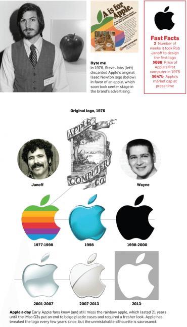
What makes the famous apple such a great mark is that it’s not a complicated design. There’s no hidden meaning that intrigues it’s audience but something that is just so simple that was tweaked to perfection over time. Nike is another good example of a brand that was able to get their logo to be as simple as possible with a little love over time. If you ask any designer, they will tell you that simplicity is harder to achieve than it looks. And more often than not, simplicity scares companies, but not Steve Jobs. The apple design goes as far back as Apple’s original logo when it was a woodcut inspired design. Back then, even Jobs knew that the logo was too complex for where Apple wanted to go. Rob Janoff was only given four words on his design brief “Don’t make it cute.” And thus, Janoff settled on the apple.

If Janoff had gone with the Isaac Newton as the icon, Apple would not have been able to get as much brand recognition as they do today. The fact that the apple is clearly universal is how they are able to be an international symbol. When Janoff presented the two versions of the mark to Jobs, one with the bite and one without, the decision was as easy as “I don’t want the mark to be mistaken for a cherry.” And that was that. Over time, all the elements seemed to have coincidental meanings. The bite in the apple for example, many people think that it exists because of the term byte, commonly used when talking about computers. Janoff gets to laugh at all the rumors mainly because a lot of them never influenced the design.
So far, the silhouetted apple has remained intact. Even though it’s a symbol that begets the function, apple has placed themselves in the same arena as Nike for logo marks that are clearly recognizable. The mark works upside down, flipped, and even in different colors. If you were to ask someone to draw the Apple or Nike logo, they would easily be able to do so. Many companies have tried to simplify their logos as well as take full ownership of their marks, but have fallen short to what Apple and Nike have done. Take for example Starbucks, who had recently stripped their logo of the circled type. They may still have a ways to go as far as simplicity, but for now, if you were to ask a consumer the same question “Could you draw the Starbucks logo” you might get some interesting results.


