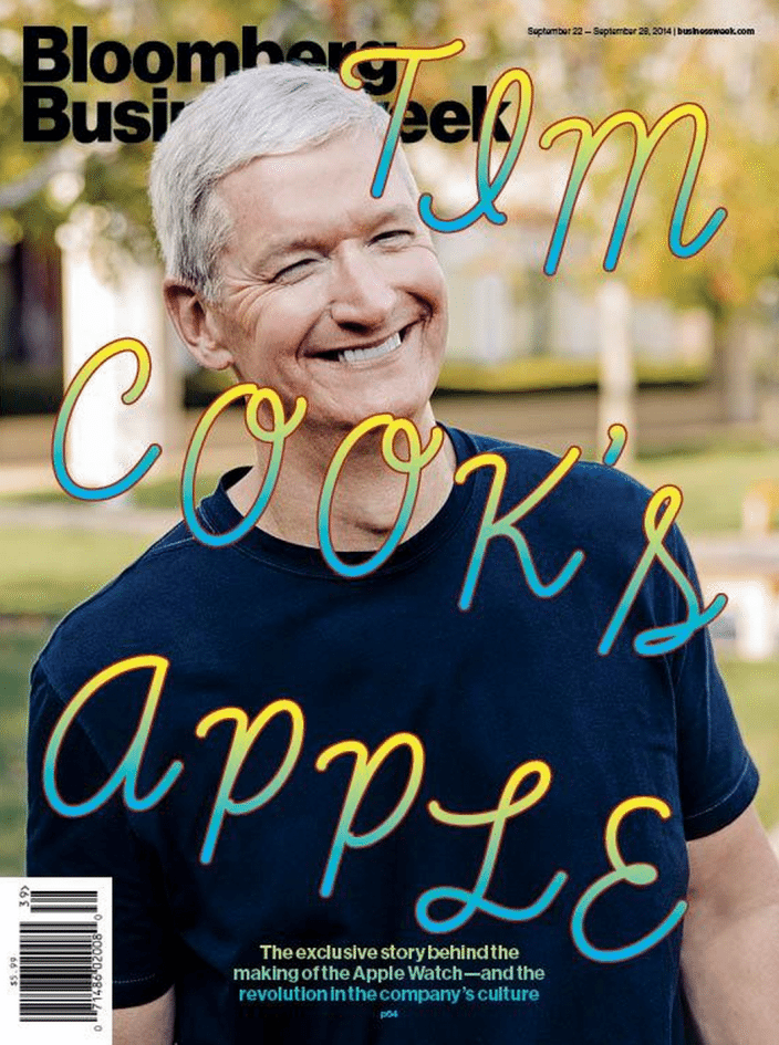
 If you have seen the latest cover of Bloomberg Businessweek, you either thought the cover designer was going out of his mind, or a genius designer was behind it all. The cover design is definitely attention grabbing, but it may not be the right kind of attention. The cover features Apple’s newest CEO, Tim Cook, with an ear-to-ear grin, in honor of the release of the iPhone 6 and Apple Watch. However, the design genius does not stop there, scrawled across the front of Tim’s photo are the words, “Tim Cook’s Apple,” in a typeface and color palette that would make a three-year-old squeal with joy.
The cringe-worthy tagline features the free typeface aptly titled Learning Curve Pro, a yellow and blue gradient fill, and a red stroke. All three elements are a blatant insult to standard design 101. The question has been raised as to the meaning behind the strong design directive. Many critics are seeing the blatant design snafu as an insult to Tim and his lack of an affinity for design. The parallel can also be drawn between the name of the typeface (Learning Curve) and Tim’s new role with Apple.
The cover design could be construed to draw comparison between Tim Cook and the late Steve Jobs. Tim Cook is known for his lackadaisical approach to design, whereas Steve Jobs would spend days in jellybean factory to find the perfect level of transparency for the iMac G3. Steve Jobs was also known to be a typography maniac, and would be greatly disappointed to see such a remedial font being associated with his pride and joy of a company.
Bloomberg claims that their sole intention for the quirky cover was to make Tim Cook look like a “happy, fun-loving CEO.” They claim that they wanted to create a cover that was the antithesis of formality and seriousness that is most often associated with a portrait of a powerful CEO. The designer’s goal for using Learning Curve as a typeface was to create something surprising and playful.
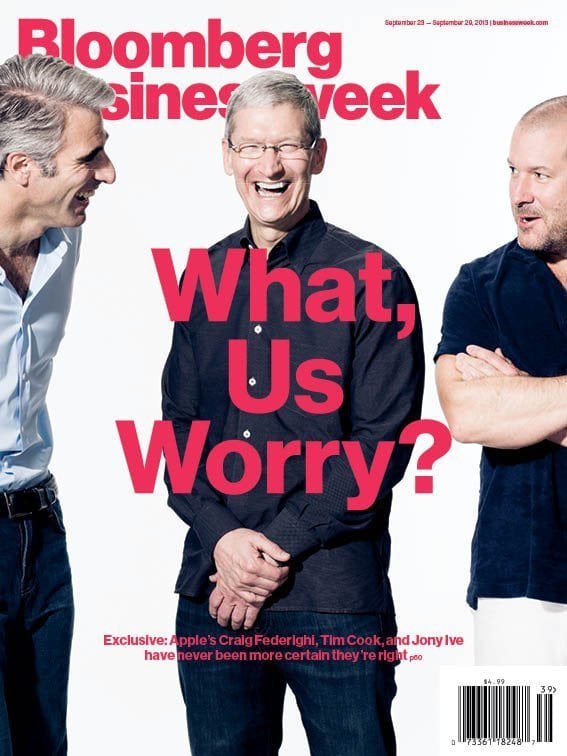 This cover is not the first time Bloomberg has used Apple’s newest CEO to make a statement. One year ago, for the September, 2013 issue of Bloomberg Businessweek, Tim Cook is featured with Apple’s head of design, Jony Ive, and software chief, Craig Federighi. The tagline read, “What, Us Worry?” The C-level Apple executives seem to be laughing at all of their critics, appearing more certain than ever that they were on the right path.
Last year’s September cover seems to paint Tim Cook and Apple in a positive light, when in comparison, this year’s cover seems like an overt insult. Anyone with an iota of design background would recognize the typeface used as unappealing, and it is downright ugly. It is interesting that Bloomberg, an “unbiased” publication, can switch its stance in such a significant way.
Whether Bloomberg Newsweek admits it or not, they were making a statement with their latest cover image. Anytime you pair a high-ranking CEO with three-year-old scribble, there is a strong message behind the design. Or, was Bloomberg just doing something “controversial” to get attention? That is an ever-present question that needs to be raised. As usual, the balance lies in the in-between, having the perfect amount of “weird” to grab attention, but you need substance to back up the interesting design. At the end of the day, if you are getting attention, you might as well make the most of it.