When Tokyo was chosen as a candidate city for the 2020 Olympics in September 2012, student Ai Shimamine participated in a design competition to create a logo for Tokyo’s bid. Her design consisted of a cherry blossom wreath, Japan’s most celebrated flower. The design also incorporated the Olympic colors and Edo period purple, a popular color used in cultural events and festivals.
In July 2015, five years before the Tokyo 2020 Olympic games kicked off, the Organizing Committee for Tokyo unveiled Kenjiro Sano’s logo designs for the Olympic and Paralympic games. The official design consisted of an animated Clarendon-esque capital T and L, and a red circle to represent Japan’s rising sun.
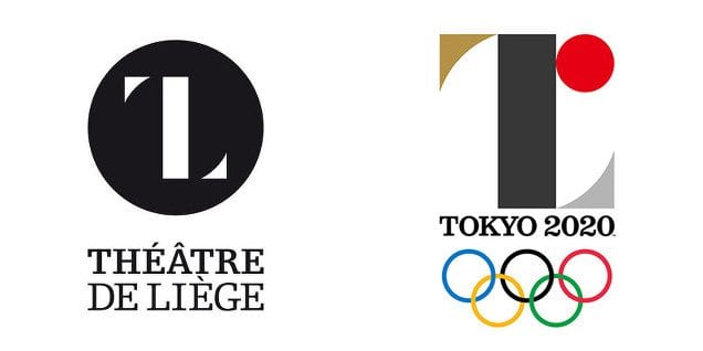
Tokyo’s Organizing Committee stated in a press release post official logo release, “The black color of the central column represents diversity, the combination of all colors. The shape of the circle represents an inclusive world in which everyone accepts each other. The red of the circle represents the power of every beating heart.”
Reactions to the new logo were mixed. Some felt that the typography was too “American” and didn’t pair with the logo. Others stated that the logo holds the delicate touches of Japanese design, and through some additional development this Olympic identity could and be a very memorable one.
Unfortunately, many pointed out the uncanny resemblance the Tokyo 2020 Olympic logo shared with Belgium’s Théâtre de Liège logo. Accusations of plagiarism were initially rejected by Japanese officials, but were recognized once Olivier Debie, designer of the Belgium Theatre’s logo, began legal proceedings to forbid Tokyo from using the mark.
Although Sano denied the allegations, the Associated Press revealed that many of his designs too closely related to other previous logo creations and pulled his design.

Seven months after scrapping their first official logo, the 2020 Tokyo Olympic Organizers had chosen from four finalists and 15,000 entries, a logo using traditional Japanese colors and shapes.
The Harmonized Checker Emblem, created by Japanese artist Asao Tokoro is a circular logo made up of various rectangles in an elegant indigo blue color. The Paralympic logo is a slightly modified version with an open circle, and both new marks represent different countries, culture, and ways of thinking “I put a lot of time and effort into this design as though it was my own child,” Tokoro stated at the unveiling ceremony.
The logo design drama is only one of many problems the organization’s committee has run into since being selected to host the 2020 Olympic games. Because of cost overruns, Tokyo has scrapped the original $2 billion Olympic stadium design and the project has now fallen a year behind schedule. Olympic organizers are now questioning the possibility that the project will meet the IOC’s completion deadline of January 2020.