
SFMOMA’s Audio Tour Experience Reimagined
SFMOMA Before & After Photos In partnership with detour, and supported by Bloomberg Philanthropies, the SFMOMA has created an app to guide viewers through the
SFMOMA Before & After Photos In partnership with detour, and supported by Bloomberg Philanthropies, the SFMOMA has created an app to guide viewers through the
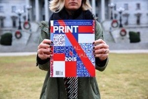
“Boost your work. Get discovered. Get the recognition you deserve. PRINT Regional Design Annual: The competition that stands apart and defines the design industry. Tens

Great marketing is always backed by a strong brand with an even stronger message. As it relates to Politicians and, more relevantly, the election for
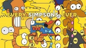
The obnoxious Pantone yellow 116 is just one of the many design aesthetics that makes The Simpsons one of the most discernable visual brands in
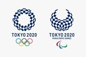
Tokyo’s Olympic Candidate Logo Created By Ai Shimamine When Tokyo was chosen as a candidate city for the 2020 Olympics in September 2012, student Ai

Brands take caution when it comes to online video marketing. Everyone has heard horror stories of high-cost videos not producing any return or low-cost videos

By: Kevin Garrison Did you know, only 57.5% of registered voters actually participated in the 2012 elections? Get Out the Vote, an AIGA campaign to
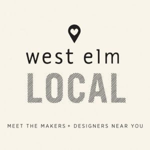
Launching in 2013 with only 2 stores, Local by West Elm has recently expanded across countless cities throughout America and now lives in over 73
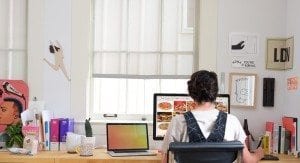
Educator and designer Tina Hardison’s experience working with companies as big as large brands and as small as start-ups and non-profits, makes her one-woman design
Today, 1 in 7 people in the United States struggle with hunger and more than 48 million American households don’t have stable access to food.
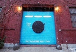
On February 2nd, an oversized Oreo door made a surprise appearance on the streets of NYC for the launch of the Mondelez cookie brand’s new
[fusion_builder_container hundred_percent=”yes” overflow=”visible”][fusion_builder_row][fusion_builder_column type=”1_1″ background_position=”left top” background_color=”” border_size=”” border_color=”” border_style=”solid” spacing=”yes” background_image=”” background_repeat=”no-repeat” padding=”” margin_top=”0px” margin_bottom=”0px” class=”” id=”” animation_type=”” animation_speed=”0.3″ animation_direction=”left” hide_on_mobile=”no” center_content=”no” min_height=”none”] The